

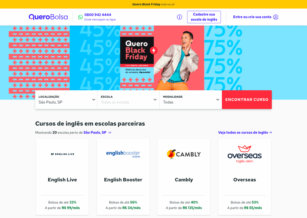
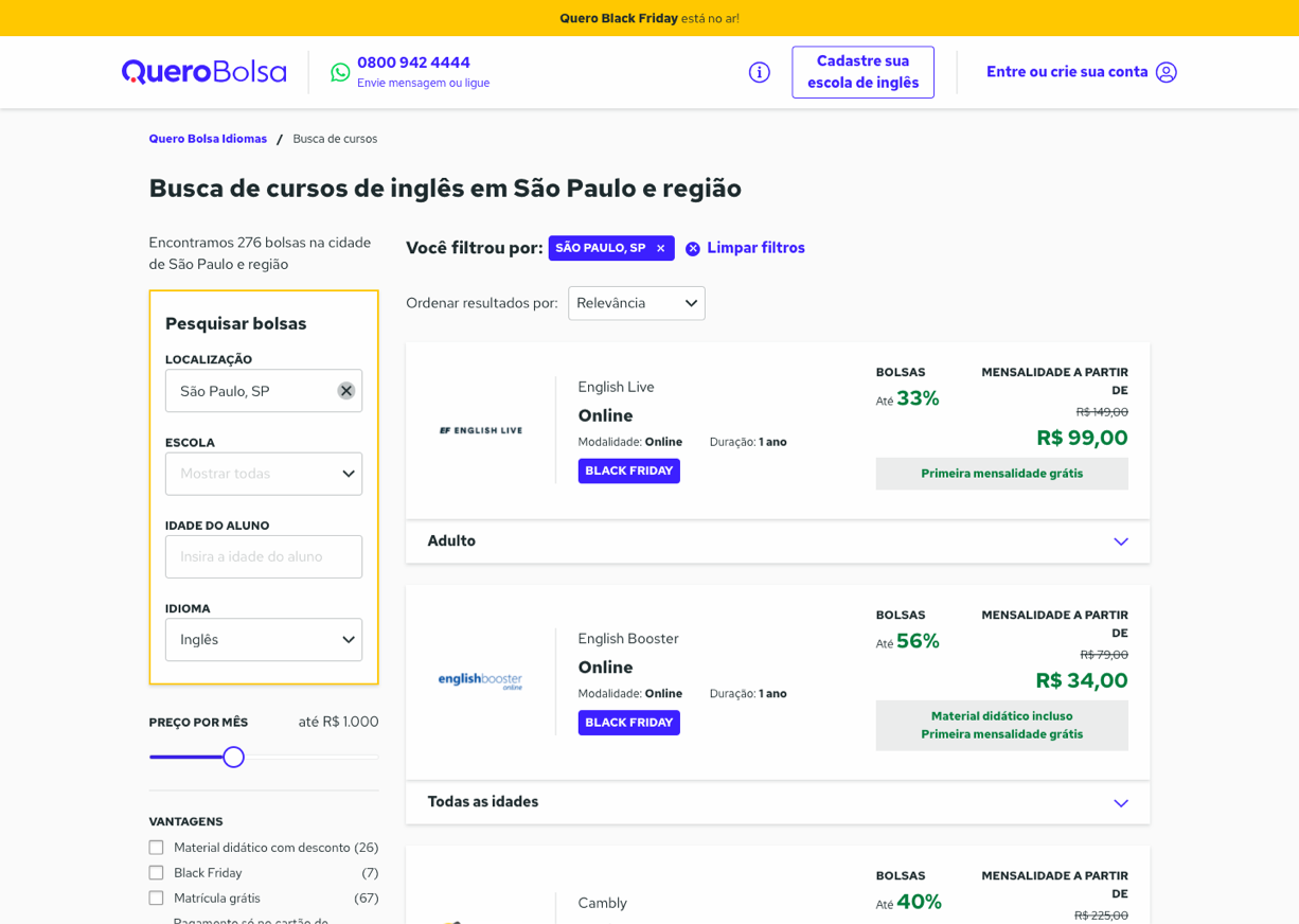
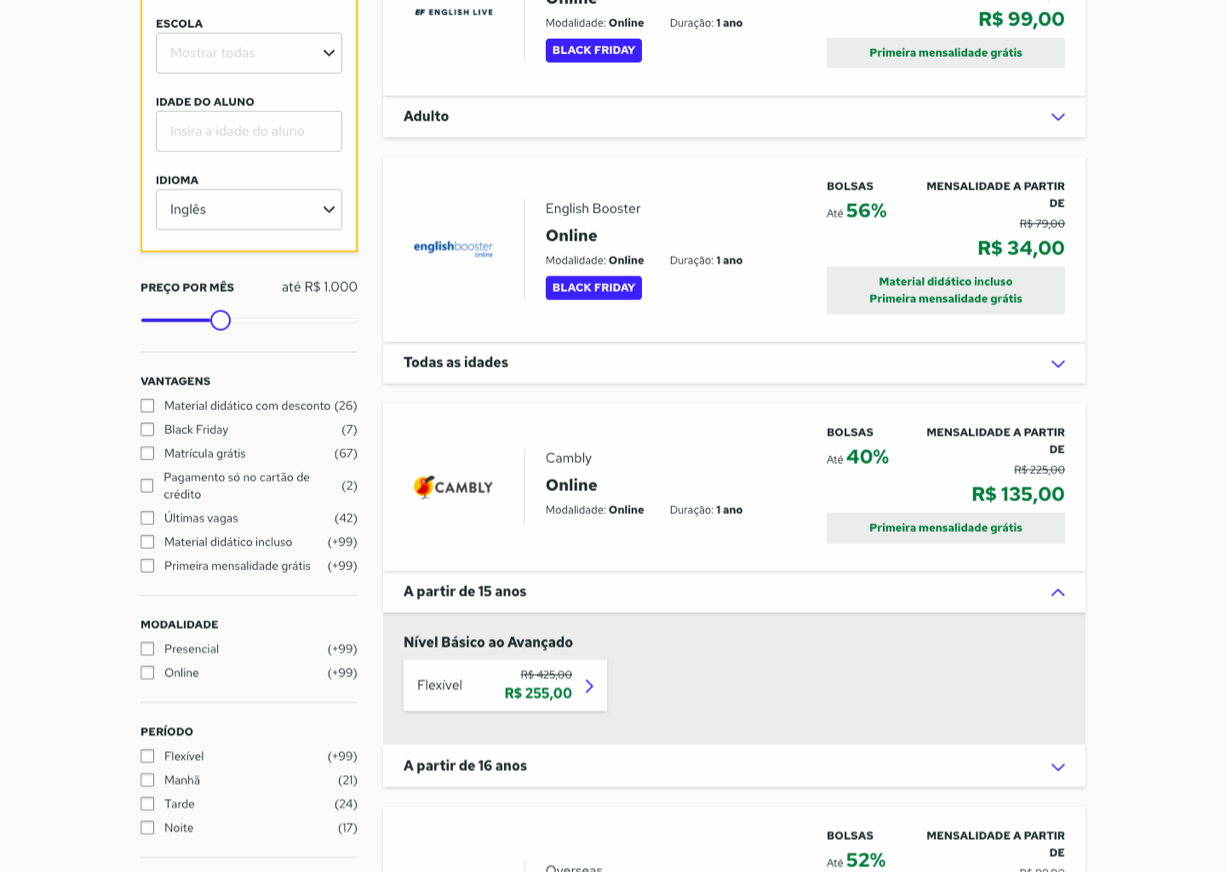
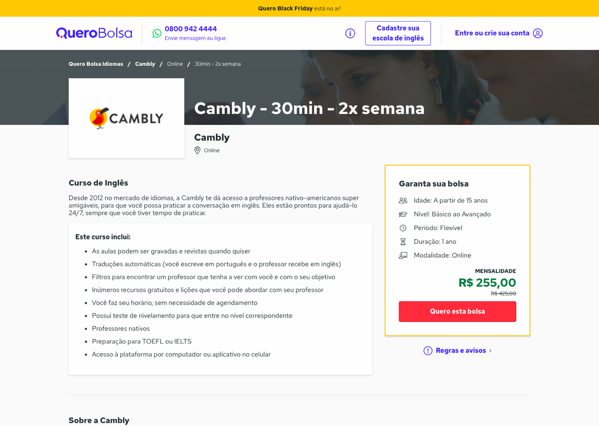
My role as a UX Designer at Quero Languages
My role, in this case, was interaction design. How to improve the user experience in a marketplace that offers language courses. It was a few months since I started to working at the team with design and marketing initiatives like SEO and Growth Hacking. This was my first UX experiment opportunity at the Quero team.


